

A successful digital product offers clear, useful experiences that help people complete daily tasks with ease. Great mobile app design starts with understanding how your audience thinks and acts. By focusing on user needs, you can turn complex ideas into simple, helpful solutions.
To succeed, balance technical needs with visual quality. While app ui/ux guides software flow and visual presentation, it also supports branding and interaction. Together, these elements make your product functional and polished.
This guide offers a practical roadmap for your project. We will cover user research, information architecture, and wireframing. You will learn to build strong systems, test them, and refine your work for a perfect final result.
Key Takeaways
- Prioritize user needs to create intuitive digital experiences.
- Understand the distinct roles of functional flow and visual presentation.
- Use research and wireframes to build a solid foundation.
- Implement testing to identify and fix usability issues early.
- Focus on ongoing refinement to keep your product relevant.
Define User Goals and Product Scope
Successful application development begins before coding starts. Define a strong foundation so your mobile app design meets real market needs. Set the scope early to prevent feature creep and keep your team focused.
Identify the Problem Your App Solves
Every great product solves a specific problem for its users. Explain your app’s main value in one clear sentence. If users cannot understand the problem, they may not see why they should download your software.
A focused problem helps you create a user-friendly design that feels intuitive. A smaller first release lets you test ideas quickly and collect useful feedback from early adopters.
Research Your Target Users and Their Context
To build something people want, understand your audience’s daily lives. Interview users and review competitor apps to find gaps in current solutions. Detailed user personas show who you serve and where they use your product.
A product requirements document guides you during this phase. It keeps each design choice based on data, not personal assumptions. This method supports high-quality mobile app design that connects with your target demographic.
Set Measurable Experience Goals
You cannot improve what you do not measure. Set success metrics, including task completion rates, session duration, and user retention. These goals guide your user-friendly design efforts and reveal areas needing improvement after launch.
Prioritize Accessibility, Speed, and Ease of Use
Performance is a feature users notice right away. Your app should load quickly and respond without lag, helping maintain engagement. Accessible products serve everyone, including people with physical disabilities.
| Metric Category | Primary Goal | Success Indicator |
|---|---|---|
| Performance | Minimize Load Time | Under 2 Seconds |
| Usability | Task Completion | High Success Rate |
| Accessibility | Inclusive Access | WCAG Compliance |
| Retention | User Loyalty | Daily Active Users |
Map the Core User Journey
Every great mobile app development project begins with a clear path. Before designing, understand how users move through your product. This ensures every screen serves a clear, useful purpose.
List the Essential Tasks Users Must Complete
Identify the main actions that show your app’s value. For a food delivery service, users search for a restaurant, select items, and confirm payment. Focusing on these high-priority actions keeps the interface clear and limits secondary features.
Build a Task Flow From First Launch to Completion
A task flow maps each screen users see after opening the app. Show this path as a logical chain of events. Documenting each step reveals bottlenecks in your mobile app development strategy early.
Remove Unnecessary Decisions and Repeated Actions
Users value efficiency, so reduce mental effort at every step. The Uber ride-booking experience uses saved locations and automatic payment methods to reduce input. Removing extra steps helps users reach goals with less friction.
Use User Stories to Clarify Each Screen’s Purpose
User stories keep attention on the “who” and “why” behind each interaction. A format like “As a user, I want to [action] so that [benefit]” keeps your team aligned. This practice ensures each screen in your mobile app development plan adds real value to the user experience.
| Journey Stage | Primary Goal | Design Focus |
|---|---|---|
| Onboarding | Value Proposition | Simplicity and Trust |
| Core Task | Goal Completion | Speed and Clarity |
| Retention | Repeat Engagement | Personalization |
| Support | Issue Resolution | Accessibility |
“Design is not just what it looks like and feels like. Design is how it works.”
Plan Your Mobile App Information Architecture
Map your app’s structure early to turn complex features into an intuitive journey. A well-organized mobile app interface supports your product and helps users find what they need without feeling overwhelmed. When you plan information flow first, you create a natural, logical path.
Group Content Into Familiar Categories
Users bring mental models from apps they use every day. Familiar categories reduce the mental effort needed to navigate your platform. Card sorting helps you discover how your target audience naturally groups information.
For example, Netflix organizes its vast library into clear, thematic rows like “Trending Now” or “Continue Watching.” This layout helps users scan content quickly instead of searching through endless lists. Using familiar patterns makes your app recognizable and easy to learn.
Create a Clear Screen Hierarchy
A strong visual hierarchy guides the user’s eye toward important elements on every screen. Use size, color, and placement to separate primary, secondary, and tertiary actions. This makes critical tasks stand out when a new view loads.
Choose Labels Users Can Understand Immediately
Avoid technical jargon and clever, abstract names that could confuse your audience. Use plain-language labels that describe exactly what a button or menu item does. Clear labels give users confidence because they know what to expect next.
Keep Important Actions Within Easy Reach
In a modern responsive design, consider how users hold their devices. Most people use phones with their thumbs, so the bottom third of the screen is easiest to reach. Place primary calls to action in this “thumb-friendly” area for greater speed and comfort.
| Navigation Type | Best Use Case | Responsive Design Impact |
|---|---|---|
| Bottom Tabs | Primary app sections | Scales well across devices |
| Hamburger Menu | Secondary settings | Saves space on small screens |
| Floating Action Button | Main task initiation | Easy thumb access |
Sketch Wireframes for Essential Screens
Your journey toward a functional mobile app starts with simple, low-fidelity sketches that shape the user experience. Focus on your product’s structure before choosing colors, images, or final branding. This method keeps your interactive app design focused on usability and clear logic.
Start With Low-Fidelity Layouts
Low-fidelity wireframes act as blueprints for your application. They let you test element placement without using advanced design tools. Simplicity is your best friend because it reveals structural flaws before they become costly coding mistakes.
Design the Onboarding, Home, and Primary Task Screens
Begin with the screens that matter most to your users. Keep onboarding brief and welcoming, and give the home screen quick access to core features. Polish primary task screens because they represent the main reason users downloaded your app.
“Design is not just what it looks like and feels like. Design is how it works.”
Place Content, Controls, and Calls to Action Intentionally
Every button and text block should serve a clear purpose in your interactive app design. Place primary calls to action where users can reach them easily with a thumb. A clean layout helps users navigate without feeling overwhelmed by unnecessary choices.
Use Empty States to Guide New or Inactive Users
Empty states are not dead ends; they can teach your audience what to do. When users have no data, use that space to suggest their next action. Clear guidance keeps users engaged and helps prevent app abandonment.
Account for Loading, Error, and Confirmation States
Great experiences must work well when problems occur or content takes time to load. Design visual feedback for loading screens, so users stay informed during delays. Helpful errors and clear confirmations make your interactive app design feel reliable and responsive in every scenario.
Build a Consistent App UI/UX System
A unified design system supports every successful mobile app design project. Shared rules for typography, color, and components turn separate screens into one coherent, professional product. This system lowers users’ mental effort and speeds up future design work.
Select a Readable Type Scale
Your typography choices shape your interface’s personality and clarity. A well-structured type scale helps users scan content without feeling overwhelmed. Few font choices and sizes create a steady rhythm that guides the eye.
Choose Colors That Support Hierarchy and Accessibility
Color does more than improve appearance; it guides user attention. Choose a palette with sufficient contrast so all users can read text clearly. Use primary colors for key actions and secondary colors to build visual hierarchy across screens.
Create Reusable Buttons, Cards, Inputs, and Navigation Components
A reusable component library helps maintain high-quality app ui/ux. Standard buttons, text fields, and cards make interactions feel familiar throughout the user journey. This supports the principle of recognition rather than recall, because users quickly learn your interface.
Maintain Consistent Spacing, Alignment, and Visual Weight
Consistent spacing and alignment create order and professionalism. A defined grid gives each element the right visual weight and prevents clutter. This detail supports polished mobile app design that feels intuitive and reliable.
A strong system simplifies your workflow and improves the final app ui/ux. These foundations create a product that looks beautiful, works well, and feels easy to navigate.
Design Navigation That Feels Predictable
Mastering navigation patterns helps you build an intuitive mobile app interface. When users understand how to move through content, they feel confident and in control. A predictable structure lowers mental effort and invites users to explore more features.
Choose Between Tabs, Navigation Drawers, and Stacks
Choose a pattern based on content depth and how often users complete each task. Tabs suit top-level destinations that users visit often because one tap opens them. For less-used features, a navigation drawer keeps the interface clean by hiding those options.
For hierarchical content, a stack works best. Users can explore details and return to the previous screen easily. Avoid mixing patterns in ways that confuse the user journey.
Make the Current Location Obvious
Users should always know where they are within your mobile app interface. Use visual cues such as highlighted tab icons, clear screen titles, and breadcrumbs. These elements act as a digital compass and help users stay oriented.
- Selected States: Change the color or icon style of the active tab.
- Screen Titles: Display the current page name clearly at the top.
- Breadcrumbs: Use these for deep hierarchies to show the path taken.
Keep Primary Navigation Focused on the Most Important Destinations
Clutter harms the user experience. Limit primary navigation to the three to five most important user tasks. This keeps your app’s most valuable areas easy to reach.
Design Back Navigation for Android and iOS Expectations
Platform conventions differ, so respecting them helps create a native feel. iOS users expect a consistent back button in the top-left corner, while Android users rely on a system-wide back gesture or button. Design your mobile app interface to support these platform behaviors instead of forcing one solution.
| Pattern | Best Use Case | Platform Strength |
|---|---|---|
| Bottom Tabs | Primary app sections | High visibility |
| Navigation Drawer | Secondary settings/profiles | Space efficiency |
| Stack Navigation | Deep content hierarchies | Logical flow |
Optimize Forms and Everyday Interactions
Efficient forms are central to great app design best practices. When you reduce data entry, you create a user-friendly design that keeps people engaged, not frustrated. Each removed field helps users reach goals faster.
Ask Only for Information You Truly Need
Each form field can block completion. Before requesting data, ask if the current task truly needs it. If you can collect it later or another way, leave it out of sign-up or checkout.
Use the Right Keyboard and Input Type for Each Field
Mobile users value interfaces that anticipate their needs. Set the right input type, such as numeric for phone numbers or email-specific layouts for addresses. The proper keyboard opens automatically and reduces taps.
Provide Inline Validation and Specific Error Messages
Showing errors only after form submission annoys users. Use inline validation to check data as users type. When errors occur, give clear steps for fixing them at once.
“Simplicity is the ultimate sophistication.”
Make Touch Targets Large Enough for Reliable Tapping
Small buttons and input fields are hard to tap on touchscreens. Make interactive elements at least 44×44 pixels for different finger sizes. This change prevents accidental taps and makes the interface more reliable.
Preserve User Input When an Error Occurs
Losing typed data after a validation error quickly harms the user experience. Your app design best practices should include state management that saves entered information. Keeping progress intact creates a user-friendly design that respects the user’s time and effort.
Add Feedback and Microinteractions With Purpose
Interactive app design depends on quiet exchanges between software and its users. Quick responses to user input build trust and clarity. These small moments make a static screen feel responsive and guide users through their journey.
Confirm Successful Actions Clearly
After users tap a button, save a file, or complete a payment, they need confirmation. A button color shift or checkmark animation gives the reassurance that the action worked. Without feedback, users may repeat an action, causing errors or duplicate data.
Use Progress Indicators for Delays and Multi-Step Tasks
When a task takes time, keep users informed to prevent frustration. Progress bars and spinners show the app is working behind the scenes. This clear feedback makes waits feel shorter and keeps users engaged during complex, multi-step processes.
“Design is not just what it looks like and feels like. Design is how it works.”
Design Helpful Empty, Offline, and Failure States
Your app should help users even when things go wrong. If users lose internet access, show a clear message or offer cached content, like Spotify’s offline listening. Empty states should guide users with a “Start your first project” button instead of leaving a blank, confusing screen.
Use Motion to Explain Change Without Distracting Users
Motion is useful in interactive app design when it shows relationships between elements. A smooth screen transition helps users understand where they are and how they arrived there. Keep animations brief and purposeful, so they improve the experience without distracting users.
Apply Responsive Design Across Devices
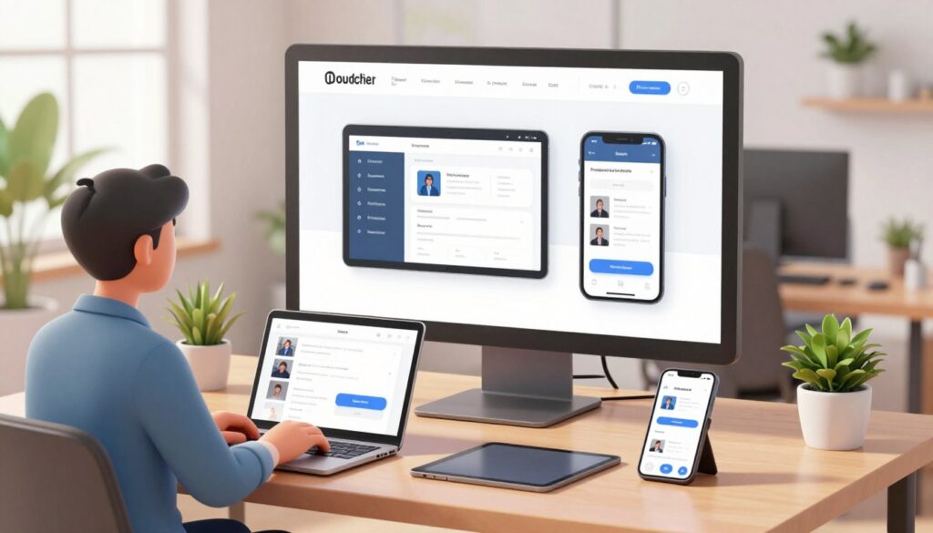
Creating a smooth experience on many devices is central to modern responsive design. Users expect your application to work well on a compact smartphone or a high-resolution tablet. Flexible layouts keep the interface clear and easy to use in every setting.
Adapt Layouts to Different Screen Sizes and Orientations
Modern mobile app design trends favor fluid grids that change with available screen space. Design components that stack or expand when users rotate devices from portrait to landscape mode. This prevents awkward cropping and keeps primary content in focus.
Support Platform Conventions on iPhone and Android Devices
Keep your brand identity consistent, but follow the distinct design languages of iOS and Android. Apple users expect patterns like the back swipe gesture. Android users expect the system back button or gesture navigation. Without these platform conventions, your app may feel unfamiliar or hard to navigate.
| Feature | iOS Approach | Android Approach |
|---|---|---|
| Navigation | Bottom tabs or stack-based | Navigation drawers or bottom bars |
| Back Action | Swipe from left edge | System back gesture or button |
| Device Variety | Limited, predictable sizes | Broad range of screen ratios |
| UI Elements | Human Interface Guidelines | Material Design standards |
Design for Safe Areas, Notches, and System UI
Modern hardware often has notches, camera cutouts, and rounded corners that may hide interface elements. Account for these safe areas so buttons and text stay clear of hardware features. Test layouts with the system status bar and home indicator for a clean, professional look.
Check Readability at Small and Large Text Settings
Accessibility is a key part of responsive design, but many developers overlook it. Users often increase system font sizes, which can break rigid layouts. Check that text containers expand smoothly and typography stays readable at the largest accessibility settings.
Test, Measure, and Refine the Experience
A structured testing approach turns design assumptions into hard evidence. Observing users interact with your interface replaces guesswork with evidence-based design. This quality focus defines professional mobile app development.
Run Usability Tests With Representative Users
Invite people who match your target audience to complete specific tasks in your app. Watch them closely as they use its primary features. Pay attention to where they hesitate or show confusion; these moments often reveal hidden friction points.
Test Core Flows on Real Devices and Network Conditions
Emulators help during early stages, but physical hardware reveals important differences. Test your app across screen sizes, battery levels, and operating system versions. Also simulate poor network conditions, so your app stays stable and responsive when connectivity is weak.
Track Completion Rates, Drop-Offs, and Support Requests
Quantitative data shows the “what,” while qualitative testing explains the “why.” Monitor analytics to find where users abandon tasks or often contact support. These metrics guide successful mobile app development by showing exactly where the user journey needs improvement.
| Testing Method | Primary Goal | Key Metric |
|---|---|---|
| Usability Testing | Identify friction | Task success rate |
| Performance Testing | Ensure speed | Load time (ms) |
| Analytics Review | Track behavior | Drop-off percentage |
Prioritize Fixes by User Impact and Implementation Effort
Not every bug or design flaw needs an immediate fix. Use a matrix to rank issues by user impact and resolution time. This strategy keeps your mobile app development process efficient and focused on high-value improvements.
Repeat Testing After Every Significant Design Change
Never assume a fix worked without verifying it through more testing. Each update can introduce new variables or unexpected behaviors. Consistent re-testing confirms that refinements improve the experience instead of creating new obstacles for users.
Apply Mobile App Design Best Practices and Trends
Creating a successful digital product requires balancing innovation and reliability. Following established app design best practices keeps your interface intuitive while adding features users expect.
Keeping up with current mobile app design trends helps you stay competitive. Still, prioritize usefulness over novelty to keep users engaged and satisfied.
Design for Accessibility From the First Wireframe
Accessibility is essential for inclusive design, not an afterthought. Start with high color contrast and scalable text during the initial wireframing phase.
Consider how users with motor or visual impairments interact with your app. Easy-to-tap targets and screen reader support make your product usable for everyone.
Protect Privacy and Explain Permissions Clearly
Users value their data, so transparency builds lasting trust. Explain why your app needs permissions, such as location or camera access, when requesting them.
Do not hide privacy settings deep inside menus. Use clear language to explain how you protect and use personal information.
Use Personalization Without Making the Interface Feel Complex
Personalization should feel like a helpful assistant, not a cluttered dashboard. Use data to suggest relevant content while keeping navigation clean and predictable.
Smart defaults can help users. Anticipating needs from their behavior reduces the mental effort needed to navigate your app.
Prepare for Voice, AI-Assisted, and Gesture-Based Interactions
Modern interfaces now go beyond simple taps and swipes. Voice commands and AI-driven suggestions can speed up common tasks.
Give advanced interactions clear fallback options. If a gesture fails or voice misunderstands a command, users need a simple manual option.
Balance Interactive App Design Trends With Familiar Usability
Adopting every new animation or interaction style can be tempting. Make sure these trends do not confuse your core audience.
If a new pattern makes a basic task harder, it may not be worthwhile. Test new features against standard usability benchmarks to confirm real value.
Keep Performance at the Center of Every Visual Decision
A beautiful app that loads slowly will quickly lose its audience. Performance limits how you should design visuals and animations.
Use lightweight assets and optimized code so your app feels fast on all devices. A responsive experience shows professional design.
| Design Element | Best Practice | Performance Impact |
|---|---|---|
| Animations | Keep them subtle and purposeful | Low battery and CPU usage |
| Images | Use modern, compressed formats | Faster initial load times |
| Navigation | Prioritize standard patterns | Reduced cognitive load |
| Permissions | Request only when necessary | Higher user trust levels |
Conclusion
Great mobile app design turns a simple idea into a tool users love. Begin with clear goals and map each user journey. Build robust systems, test every flow, and refine performance so your product stands out in a crowded market.
Strong mobile app design improves usability and boosts retention rates. It builds audience trust and strengthens your brand perception. By focusing on real user needs, you create meaningful connections that support long-term success.
Your work does not stop at the initial launch. Validate your assumptions through real-world data and user feedback. Respect platform conventions on Apple iOS and Google Android to keep your interface feeling natural.
Measure outcomes against your initial goals to find areas for improvement. Keep iterating on your mobile app design as technology evolves. Constant refinement keeps your product a top choice for users.