
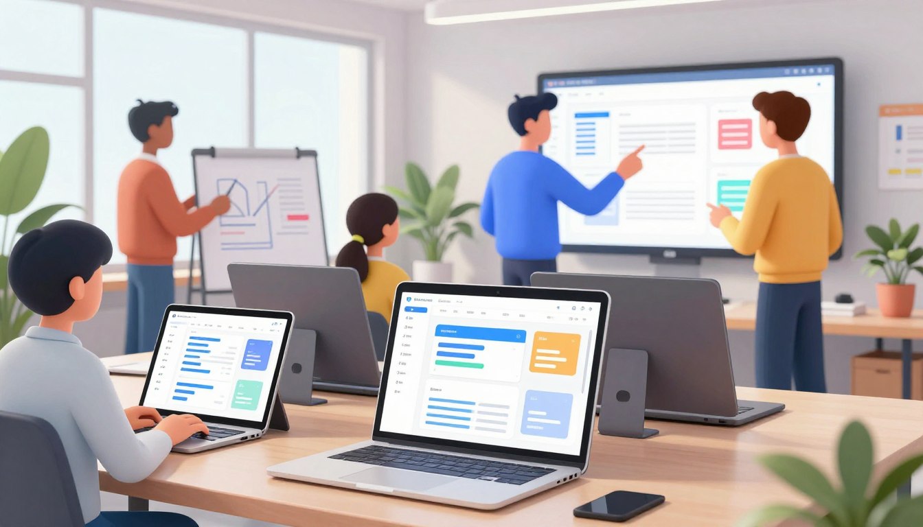
The digital world is always changing, making designers rethink their work. You might have seen a move from heavy textures to clean designs. These ui/ux design trends show a shift towards simplicity and motion.
Today, user interface design focuses on being clear and fast. It moves away from too much visual stuff. By choosing minimalism, you make spaces that are easy to use and feel friendly.
But, beauty is just one part of the story. True user experience design also means making things accessible and useful. Before you adopt a new style, think if it really helps your users or if it’s just a trend. Focus on what your users need to make sure your work stays useful and relevant over time.
Key Takeaways
- Prioritize accessibility and usability over purely decorative elements.
- Minimalism helps reduce cognitive load for your site visitors.
- Motion should be purposeful rather than just a visual distraction.
- Adaptive layouts ensure your product works across all modern devices.
- Always test new styles against your specific audience requirements.
Why UI/UX Design Trends Matter for Modern Digital Experiences
Modern digital experiences are shaped by a constant tug-of-war between innovation and user familiarity. As you navigate the fast-paced world of technology, understanding these shifts becomes a competitive advantage for your brand.
How changing user expectations influence interface design
Your users are more digitally literate than ever before. They interact with a vast array of devices, from smartwatches to ultra-wide monitors. This forces interface design trends to evolve rapidly. People now expect seamless transitions and intuitive navigation regardless of the screen size.
Accessibility has also moved from a secondary consideration to a core requirement. Users demand inclusive products that accommodate different physical and cognitive abilities. When you prioritize these expectations, you build a stronger connection with your audience.
Balancing visual appeal, usability, and business goals
A beautiful interface is only effective if it serves a clear purpose. You must find the right balance between user interface design and the underlying user experience design to ensure your product remains functional. Aesthetics should never come at the cost of performance or conversion rates.
Think of your design as a bridge between your business objectives and user needs. If a trendy layout confuses your customers or slows down your site, it fails to meet its primary goal. Always measure the success of your design by how well it solves real problems for your users.
When to adopt a trend and when to prioritize proven patterns
Not every new style deserves a place in your product. Consider the shift from the heavy textures of skeuomorphism to the clean lines of flat design 2.0. This transition happened because users needed faster, more readable interfaces on mobile devices.
You should only adopt a trend when it offers a genuine improvement to the user journey. If a proven pattern already works well for your specific audience, stick with it. Innovation is valuable, but consistency often builds the trust required for long-term user loyalty.
AI-Powered Personalization Is Reshaping User Experiences
Imagine a digital interface that learns your preferences and meets your needs instantly. AI-powered personalization turns static layouts into dynamic environments. This change makes personalized user journeys feel natural and not forced.
Using artificial intelligence to tailor content and recommendations
Today’s software uses machine learning to understand and suggest what you might like. It’s like when a streaming service recommends your next favorite show. Or when an e-commerce site shows products based on what you’ve bought before. The goal is to make things easier for you.
Adapting support journeys is another way to improve. Chatbots and conversational interfaces can offer help before you even ask. This makes your digital product feel like a helpful partner, not just a tool.
Designing transparent AI interactions that keep users in control
Automation is powerful, but it must respect user freedom. Always make sure your audience knows when they’re talking to a machine. Being open builds trust and makes users feel at ease with the technology.
Explaining automated decisions without overwhelming your audience
When your system suggests something, explain why. For example, saying “Because you viewed this category” helps users understand. Keep these explanations simple to avoid confusing them with too much information.
Preventing personalization from becoming intrusive
Personalization should make things better, not feel like spying. Don’t collect too much data that might make users uncomfortable. Give users clear options to adjust their settings or opt out anytime. This way, personalized user journeys stay helpful and respect privacy.
The best AI user experience is one that’s invisible but very useful. By mixing smart automation with design that puts people first, you can create conversational interfaces and systems that really meet your audience’s needs.
Multimodal Interfaces Make Digital Products More Flexible
You can now interact with your favorite apps in new ways. Modern multimodal interfaces let you choose how you want to interact. This makes using technology more natural and easy.
Combining touch, voice, text, gesture, and visual input
Designers are now using different ways to interact. This makes systems more flexible and less frustrating. For example, you might use a touch screen and voice commands together.
- Touch: Provides precise control for navigation and selection.
- Voice: Offers hands-free convenience for quick commands.
- Gesture: Enables interaction without physical contact with the screen.
- Visual Input: Allows the system to recognize objects or user presence.
Creating consistent experiences across different interaction methods
Consistency is key for a great user experience. Whether typing or speaking, the system should act the same. This makes the interface predictable and easy to use.
Switching between modes should not disrupt your workflow. This ensures a smooth experience on any device.
Designing clear feedback for voice and gesture interactions
Voice and gesture inputs need clear visual confirmations. You should know if the system heard you or recognized your movement. If there’s an error, the system should offer help or alternatives.
Effective feedback connects your intent with the system’s action. Showing status indicators or animations confirms your request. This builds trust and reduces frustration.
Supporting users who switch between devices and input types
Modern life means using different devices all day. Seamless cross-device experiences keep your preferences and data together. This is crucial for staying productive.
Designers should focus on keeping your session consistent during device changes. By supporting multiple input types, products become more inclusive. The goal is to provide a reliable experience that respects your time and preferences.
Accessible and Inclusive Design Is Becoming a Core Standard
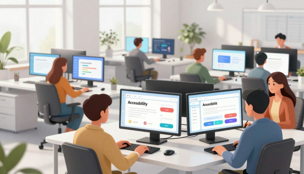
Designing for everyone is now a must for digital products. By embracing inclusive design, your platform welcomes all abilities. This approach makes your site more robust and flexible for everyone.
Supporting diverse abilities and situational needs
Digital accessibility goes beyond just disabilities. It also considers temporary issues and situational constraints. Designing for these cases improves your product for everyone.
Building with empathy means understanding users’ different environments. A well-designed interface adapts to these needs. This ensures no one is left out, regardless of their situation.
Enhancing clarity through visual and structural design
To make accessible user interfaces, focus on visual communication basics. High color contrast helps those with low vision. Clear typography ensures text is readable on all devices. Visible focus states are crucial for non-mouse users.
Technical requirements for navigation and motion
Your site must work for screen reader or keyboard users. Use semantic HTML for structure and clear labels. Also, offer reduced motion options for those who get sick from fast animations.
The necessity of human-centered testing
Automated tools are good for basic checks, but real-world testing is key. Include people with diverse abilities in your feedback. Inclusive design is a continuous learning and improvement process based on real experiences.
| Feature | Standard Practice | Inclusive Benefit |
|---|---|---|
| Color Contrast | 4.5:1 Ratio | Helps users with visual impairments |
| Keyboard Support | Full Tab Navigation | Supports motor-impaired users |
| Semantic HTML | Proper Heading Tags | Improves screen reader efficiency |
| Motion Control | Pause/Stop Buttons | Prevents vestibular triggers |
Motion Design and Microinteractions Give Interfaces More Clarity
Motion design is like a silent language for your digital product. It uses microinteractions to give users instant feedback. This makes the interface feel alive and responsive.
Using animation to communicate system status and user actions
UI animation is like a guide for users. When they click a button or submit a form, a small animation shows the system has received it.
This clarity stops confusion during wait times. It turns a static screen into a conversation. Users always know what’s happening behind the scenes.
Creating responsive buttons, transitions, loading states, and confirmations
Your buttons should react quickly to touch or clicks. A small scale change or color shift gives users the feel they expect from modern software.
Transitions between pages should be smooth, not jarring. Using loading states that move smoothly keeps users engaged while data processes.
Keeping motion purposeful rather than distracting
Every movement should have a specific goal. If you use scroll-triggered animation, make sure it tells a story or highlights important content, not just for flair.
Avoid decorative movement that gets in the way of essential actions. Purposeful motion should always help users complete their tasks without visual distractions.
Respecting performance needs and reduced-motion preferences
Always think about your performance budget when adding complex effects. Heavy animations can slow down load times, hurting the user experience.
You must also respect system-level reduced-motion preferences. Providing a clean, static alternative ensures your design is accessible and comfortable for everyone.
Content-First and Minimalist Interfaces Reduce Cognitive Load
Putting content first makes things easier for your users. It means every design choice has a purpose. This content-first design approach helps you plan your layout before picking colors or icons.

Letting user needs shape layouts before visual styling begins
Starting with what users need helps you plan their path. Knowing their goals, you can create a clear path for them. This way, you avoid forcing content into a template that doesn’t fit.
Using hierarchy, whitespace, and concise language to improve comprehension
A good information hierarchy guides the eye. Size, weight, and color show what’s important. Whitespace lets content breathe, making it stand out without being too much.
Clear language makes things simpler. It cuts out extra words that distract. This mix of visual and textual clarity is key to minimalist interfaces.
Removing decorative elements that compete with important actions
Minimalism is about cutting out the noise, not useful info. Decorative stuff can distract from what’s important. By removing it, you keep the user focused.
Making complex products easier to scan and navigate
Even complex things are easier with a clean layout. Users scan, not read every word. A well-organized site lets them find what they need quickly.
| Design Element | Cluttered Approach | Minimalist Approach |
|---|---|---|
| Visual Focus | Multiple competing elements | Single primary action |
| Information Density | High, overwhelming text | High, scannable content |
| User Experience | High cognitive load | Low cognitive load |
| Navigation | Complex and hidden | Clear and intuitive |
Dark Mode and Adaptive Themes Are Becoming Expected Features
Your users spend hours on screens, making the choice between light and dark mode vital for comfort. Providing a flexible interface is no longer just a luxury; it is a standard requirement for modern digital products. By offering adaptive themes, you show that you value the user’s physical well-being and visual preference.
Designing dark interfaces that preserve readability and contrast
Effective dark mode design requires more than just inverting your color palette. You must carefully manage color contrast to ensure that text remains legible against dark backgrounds. Simple inversion often leads to eye strain and a loss of visual hierarchy.
Instead, use subtle shades of gray for backgrounds. This reduces vibration and makes the interface feel more natural. Always maintain enough contrast to keep your content accessible for all users.
Supporting system preferences without removing user control
Most modern operating systems allow users to set a global preference for their interface theme. Your application should automatically detect these settings to provide a seamless transition. However, you should always include a manual toggle within your settings menu.
Giving users the final say ensures they can override system defaults when necessary. This level of control builds trust and accommodates specific environmental needs. A user might prefer a light interface during the day, even if their system is set to dark.
Choosing colors that work across light and dark backgrounds
When selecting your color palette, test how each hue performs in both modes. A color that looks vibrant on a white background might appear muddy or neon on a dark one. Use a design system to define tokens that automatically adjust based on the active theme.
Testing illustrations, charts, images, and status indicators in both themes
Visual elements often require specific adjustments to remain clear in different modes. Icons and illustrations that rely on heavy outlines may need to be simplified or recolored. You must verify that your data visualizations remain readable and that status indicators like error messages stay visible.
| Element Type | Light Mode Strategy | Dark Mode Strategy |
|---|---|---|
| Backgrounds | Use off-white or light gray | Use dark charcoal or deep navy |
| Text | High-contrast dark gray | Soft white or light gray |
| Charts | High-saturation colors | Muted, neon-balanced colors |
| Icons | Solid, dark strokes | Light, filled or outlined |
3D, Spatial Design, and Immersive Interfaces Expand Interaction
The digital world is moving from flat screens to immersive, three-dimensional spaces. 3D web design brings a sense of scale and realism that flat screens can’t match.
Using depth, layering, and perspective to create visual context
Depth and layering show how different parts of a page relate. Perspective guides the user’s eye to key parts of the interface.
Interactive product models let customers see items from all sides. This visual context boosts confidence, as users feel they know the product well before buying.
Designing for augmented reality, virtual reality, and spatial computing
Augmented reality design mixes the digital and real worlds. It adds data to our surroundings, helping with navigation or shopping.
Spacial computing lets users interact with digital objects as if they were real. Virtual tours or AR previews make digital experiences feel real and memorable.
Maintaining orientation and reducing discomfort in immersive environments
Designing for virtual spaces means keeping users comfortable. Fast movements or confusing transitions can cause motion sickness, spoiling the experience.
Always give users clear visual cues to keep their sense of direction. Smooth transitions and steady lighting help users feel grounded while exploring.
Knowing when a two-dimensional interface is the better choice
While 3D elements are exciting, they’re not always best. Sometimes, a simple, two-dimensional interface is faster and easier to use.
Think about your design’s performance and the user’s goals. If a 3D model is slow or makes a simple task hard, choose a 2D version. Focus on being useful, not just new, to keep your product easy to use.
Design Systems Help Teams Scale Consistent Products
Building a successful product at scale needs a solid design system. As your project grows, keeping a unified look across screens gets tough. Design systems give your team the tools to work faster and keep the user experience consistent.
Creating reusable components, patterns, and design tokens
Efficiency starts with breaking down your interface into smaller pieces. Using reusable UI components like buttons and input fields saves hours. These elements are often powered by design tokens, the smallest building blocks for your visual styles.
- Design tokens store values like colors, spacing, and typography.
- Patterns define how components work together in common layouts.
- Shared libraries ensure that every team member uses the latest version of an asset.
Connecting design system decisions with accessible development practices
A great system does more than look good; it works for everyone. By integrating accessible development into your workflow, you make your product inclusive. This means contrast ratios, keyboard navigation, and screen reader support are handled automatically.
| Feature | Standard Approach | System-Driven Approach |
|---|---|---|
| Color Contrast | Manual check per page | Automated token validation |
| Focus States | Inconsistent styling | Unified, accessible indicators |
| Keyboard Flow | Often overlooked | Built-in logical tab order |
Documenting component behavior for designers, developers, and product teams
Documentation is key to keeping your product team together. You must clearly define how each component behaves. This reduces the risk of miscommunication and technical debt.
Managing flexibility without creating inconsistent user experiences
While consistency is vital, your system must also be flexible. Create a core set of foundational components that allow for minor variations. This empowers your team to innovate while keeping the design professional and reliable for users.
Privacy-Centered Design Builds Trust Into Every Interaction
Your users should feel safe and respected when using your digital products. By focusing on privacy-centered design, you build real trust. This makes every interaction feel secure and focused on the user.
Making permissions, data collection, and account controls understandable
Clarity is key in privacy UX. Explain data collection in simple terms, not in legal jargon. When users know what info you collect and why, they can make better choices.
Account controls should be easy to find and use. Place them where users naturally look. Giving users control over their data makes them feel in charge.
Replacing dark patterns with honest choices and clear consequences
Dark patterns trick users into sharing more data than they want. These tactics harm your brand and erode trust. Choose ethical UX design to offer honest, clear options instead.
Being transparent means making it easy to say no. Offering equal choices shows respect for the user’s freedom. Follow these tips to improve your design:
- Default to privacy: Always choose the most protective settings by default.
- Clear consequences: Explain what happens when users choose in or out.
- No pressure: Don’t use guilt or urgency to sway user decisions.
Using plain language for consent and privacy notices
Legal documents can be scary, but your notices don’t have to be. Use simple language to explain why you need data. This makes privacy UX easy for everyone to understand.
Showing users how to review, change, or delete their data
Trust grows when users can manage their data easily. Offer a dashboard for viewing, downloading, or deleting data. This shows you value users more than their data.
Choosing not to use dark patterns is wise. It builds a lasting relationship with your users. By prioritizing privacy, you keep your audience coming back with confidence.
Conclusion
Your journey in the industry is about mixing new ideas with timeless values. The latest ui/ux design trends give you tools to connect with your audience. But, these tools are most effective when they have a clear purpose.
Putting the user first is key. This ensures every interaction adds real value. It’s not just about looks; it’s about function too.
The future of UX design is about combining tech with empathy. Figma says 72% of designers use generative AI every day. It’s important to use these tools to improve your work, not just do it for you.
Good design comes from knowing what works and what you want to achieve. Focus on making things easy to use and private. This builds trust with your users.
What changes will you make in your next project? Share how these changes affect your work. Your insights help everyone grow and improve.